
Overview
Custom CSS is an HT Mega module that allows you to write element-specific CSS within Elementor. Use the selector keyword to target elements precisely without needing complex CSS selectors.
Key Benefits
- Element-Specific Styling: Apply CSS to individual elements
- Smart Selector Keyword: Automatically targets elements with
selector - No Complex Selectors: Skip complex class names and IDs
- Override Default Styles: Customize Elementor’s limitations
- No Conflicts: Isolated CSS prevents style conflicts
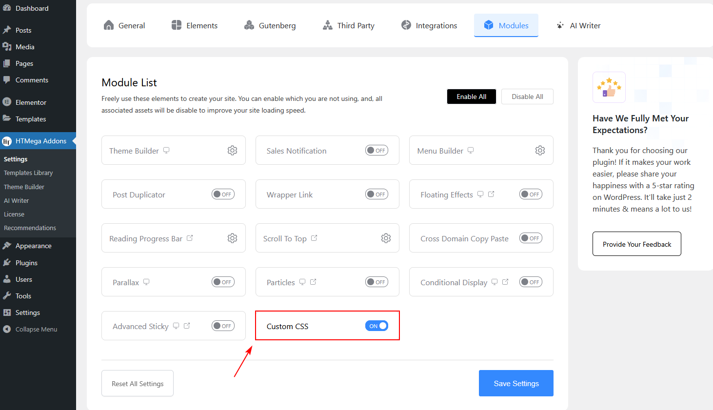
How to Enable Custom CSS
- Access HT Mega Settings
- Go to HT Mega → Modules
- Locate Custom CSS and toggle the switch to ON
- Click Save Settings
How to Use Custom CSS
- Open Elementor Editor
- Edit any page or post with Elementor.
- Select an Element
- Click on any widget, column, section, or container to highlight it.
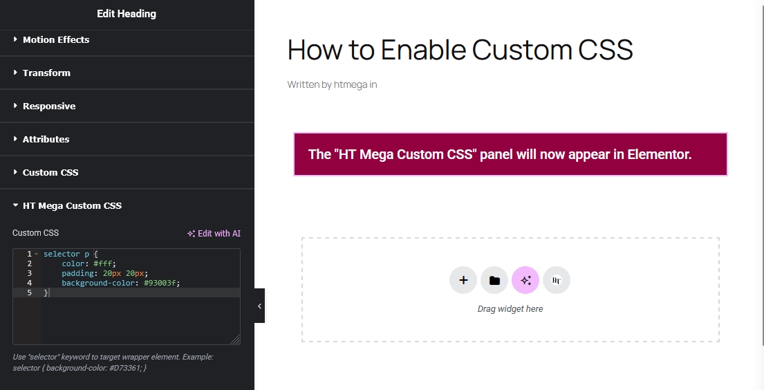
- Navigate to Advanced Tab
- Click the Advanced tab and find the HT Mega Custom CSS section.
- Write Your CSS
- Enter your custom CSS code using the
selectorkeyword. Preview changes in real-time.
- Enter your custom CSS code using the
The Selector Keyword
The selector keyword automatically targets the current element’s wrapper. No need to write complex selectors—HT Mega handles the rest.
Example CSS:
selector {
    background-color: #D73361;
    padding: 20px;
}
HT Mega converts it to:
.elementor-element-abc123 {
    background-color: #D73361;
    padding: 20px;
}
Syntax & Examples
Basic Styling
- Change Background Color
selector {
    background-color: #D73361;
    border-radius: 10px;
    padding: 30px;
}
- Custom Border
selector {
    border: 3px solid #10B981;
    box-shadow: 0 4px 15px rgba(0,0,0,0.1);
}
Hover Effects
- Scale on Hover
selector {
    transition: transform 0.3s ease;
}

selector:hover {
    transform: scale(1.05);
}
- Color Transition
selector {
    background-color: #5E6BF4;
    transition: background-color 0.4s ease;
}

selector:hover {
    background-color: #F59E0B;
}
Targeting Child Elements
- Style Headings Inside
selector h2 {
    color: #ffffff;
    font-weight: 700;
    text-transform: uppercase;
}
Advanced Techniques
- Responsive Styling
selector {
    padding: 40px;
}

@media (max-width: 768px) {
    selector {
        padding: 20px;
    }
}
- Pseudo Elements
selector::before {
    content: '';
    position: absolute;
    background: linear-gradient(to bottom, #5E6BF4, #10B981);
}
Use Cases & Examples
1. Custom Hover Effects
selector {
    position: relative;
    overflow: hidden;
}

selector::after {
    content: '';
    position: absolute;
    width: 0;
    height: 0;
    background: rgba(255, 255, 255, 0.3);
    transition: width 0.6s, height 0.6s;
}

selector:hover::after {
    width: 300px;
    height: 300px;
}
Result: Ripple effect on hover.
2. Gradient Backgrounds
selector {
    background: linear-gradient(45deg, #667eea 0%, #764ba2 50%, #f093fb 100%);
    background-size: 200% 200%;
    animation: gradient-shift 5s ease infinite;
}
Result: Animated gradient background.
Best Practices
✅ Do’s
- Use the selector keyword to simplify targeting
- Test responsively on all device sizes
- Add comments to your CSS
- Use transitions for smoother animations
❌ Don’ts
- Avoid using
!importantunless necessary - Don’t overwrite Elementor essentials
- Don’t use inline styles
Troubleshooting
Issue: CSS Not Applying
- Solutions:
- Check for syntax errors
- Clear Elementor cache
- Use DevTools to inspect elements
Issue: Styles Break on Mobile
- Solutions:
- Add responsive media queries
- Test in Elementor’s responsive mode
Frequently Asked Questions
- Do I need CSS knowledge to use this?
Basic CSS knowledge is helpful for better customization. - Can I use CSS frameworks?
You can write CSS directly in the editor but can’t import external frameworks. - Does it work with Elementor Pro?
Yes, it works with both Elementor Free and Pro.
Last updated on November 26, 2025
Was this article helpful?
Powered by Support Genix