
The Gutenberg Info Box Block by HT Mega embodies a modern and sleek design, meticulously crafted to elegantly showcase your information within a stylishly designed block.
Steps of adding Info Box Block
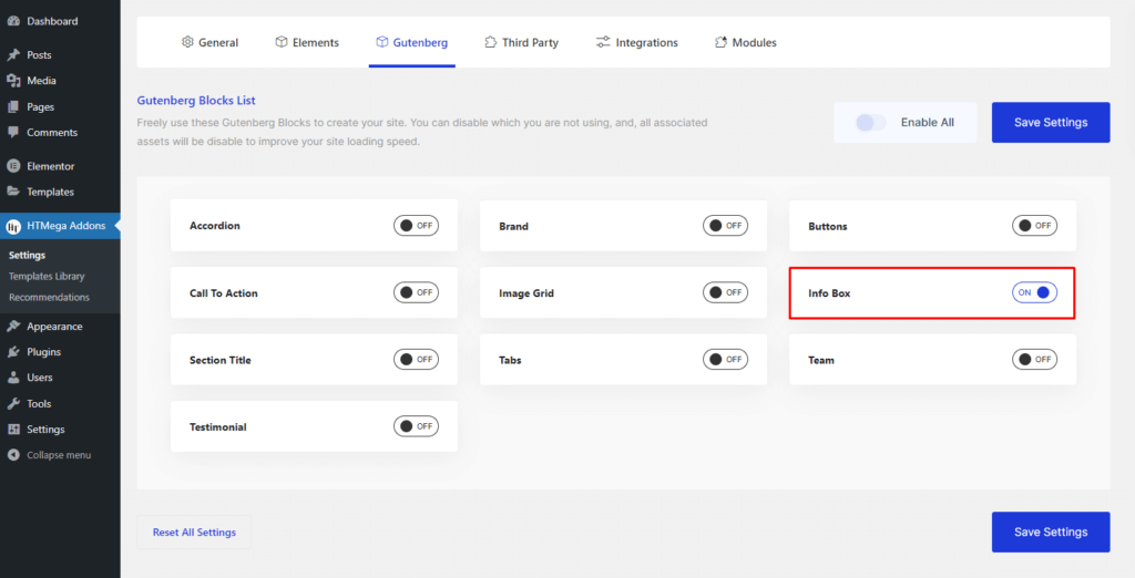
Go to WordPress Dashboard > HTMega Addons > Settings > Gutenberg. From the list of Blocks, turn ON the “Info Box” Block.
Step 1: How to Enable Info Box Block?
Step 2: How to use the Info Box Block?
To add the Info Box block, search by “Info Box” and use the Block that has the “HT prefix”.
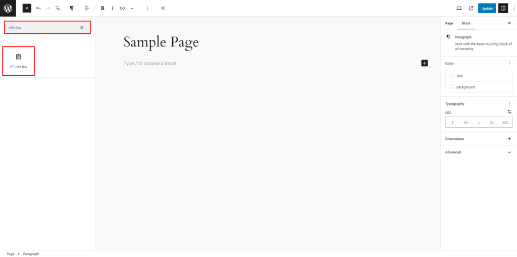
Drag and drop or click on the “Info Box” block to insert it into the page.
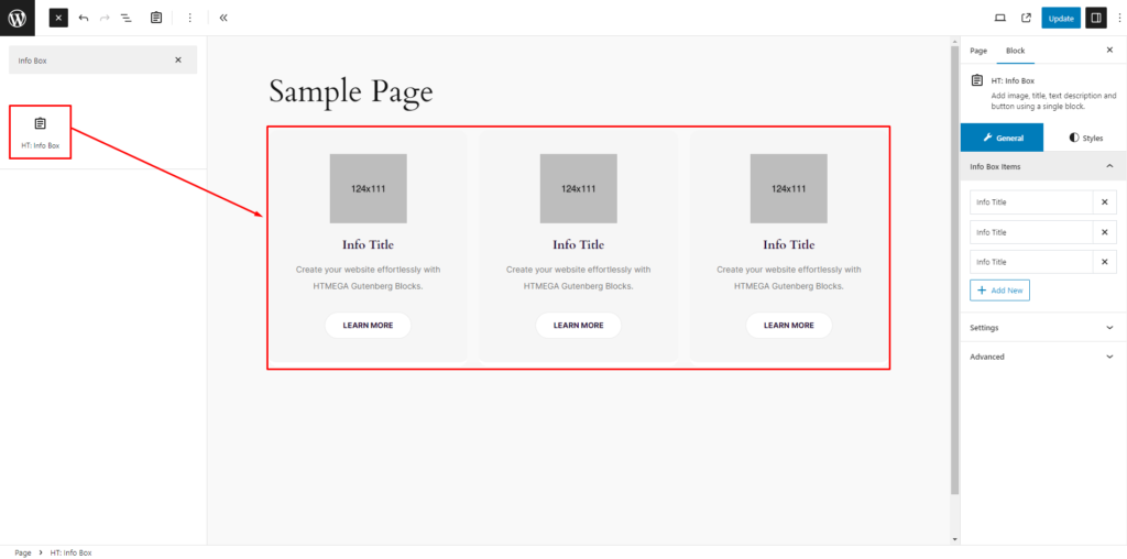
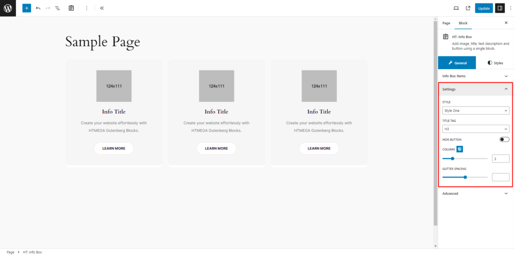
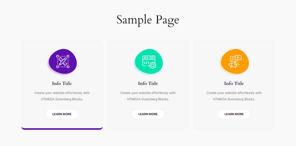
Step 3: How to Insert/change Info Box information
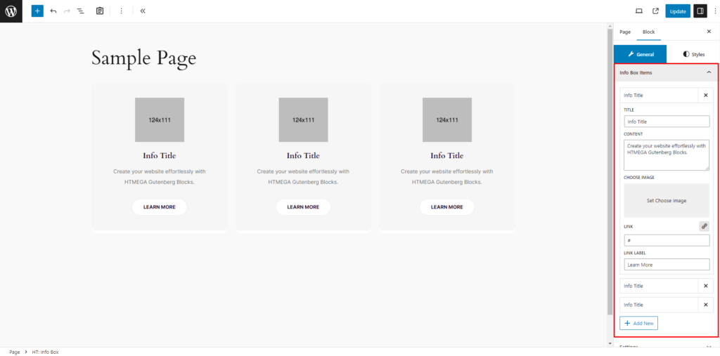
Info Box Items: In the Info Box Items feature, you possess the capability to effortlessly add, modify, or delete individual Info Box items. Additionally, you have full control over customizing the Title, Content, Image selection, and Button options.
Settings: In the Settings section, you have the ability to configure various aspects such as Preset Style, Title HTML Tag, Hide Button switch, Column, and Gutter Spacing for the Info Box block.
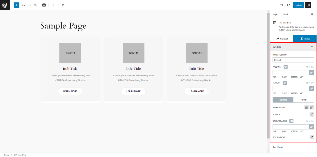
How to customize the Info Box style
Info Box: In the Info Box section, tailor Image Position, Padding, Margin, Background Color, Border, Border Radius, and Box Shadow for both Normal and Hover states with precision.
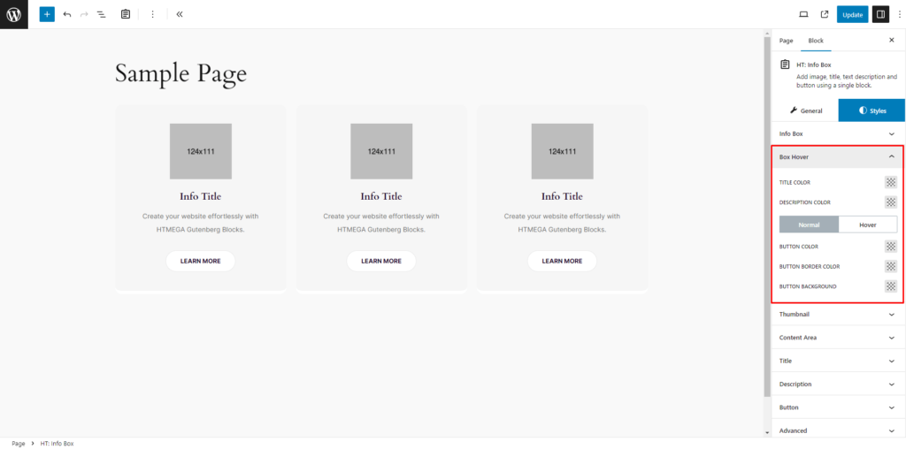
Box Hover: In the Box Hover section, effortlessly customize Title Color, Description Color for the info box hover style. Additionally, adjust Button Color, Button Border Color, and Button Background Color for both Normal and Hover states, ensuring a seamless transition.
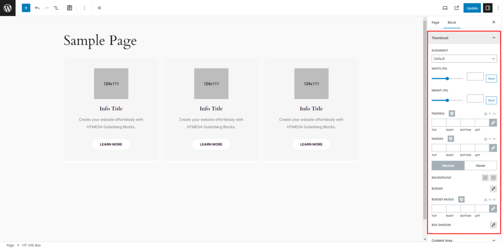
Thumbnail: In the Thumbnail section, fine-tune Box Info Thumbnail Alignment, Width, Height, Padding, and Margin for a personalized touch. Customize Background Color, Border, Border Radius, and Box Shadow for both Normal and Hover states, ensuring a cohesive style.
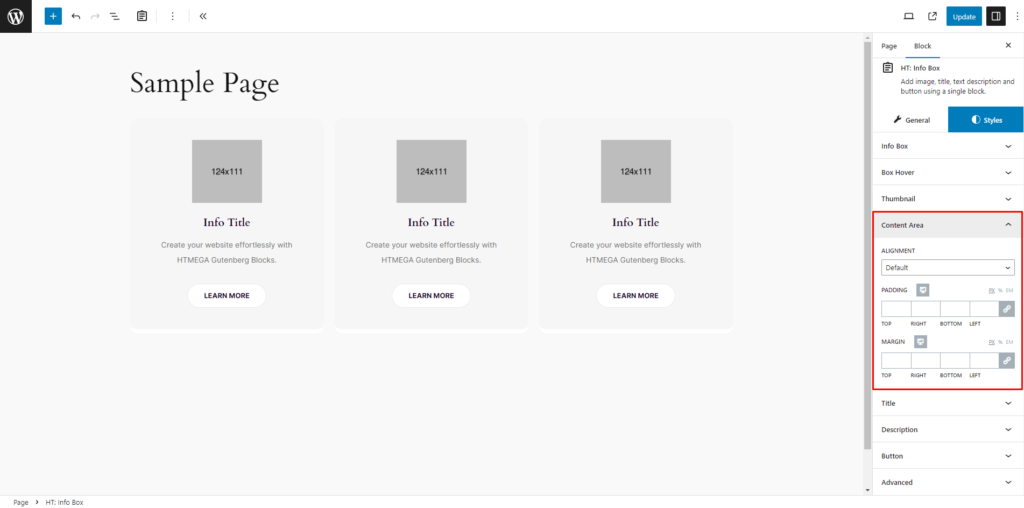
Content Area: Customize Alignment, Padding, and Margin to suit your preferences.
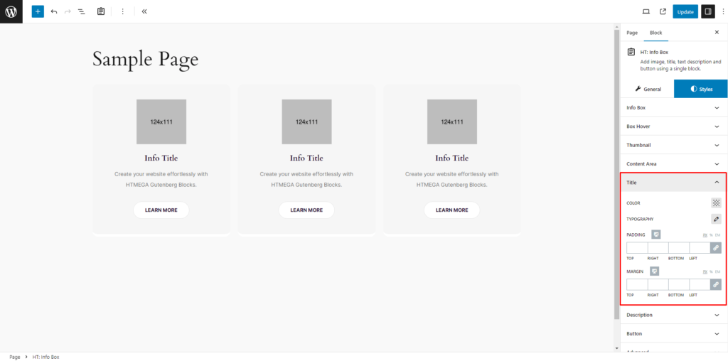
Title: Adjust Title Color, Typography, Padding, and Margin according to your preferences.
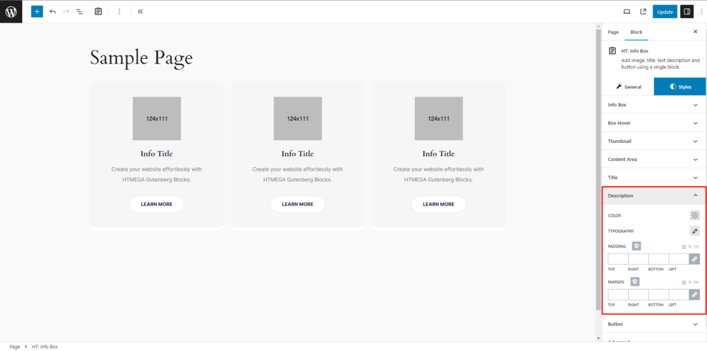
Description: Customize Description Color, Typography, Padding, and Margin to your liking.
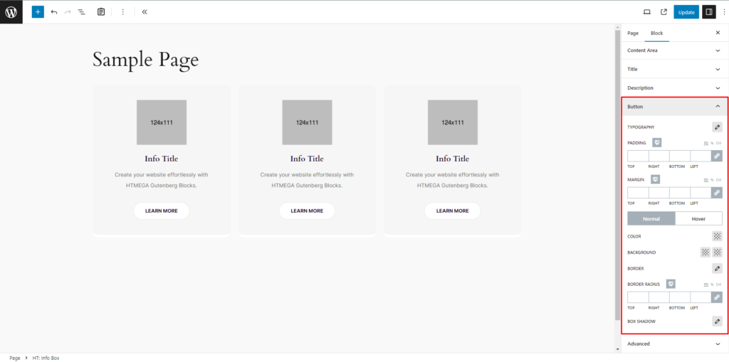
Button: Tailor button typography, padding, and margin as necessary. Additionally, customize Color, Background, Border, Border Radius, and Box Shadow for both Normal and Active states according to your requirements.
Step 4: Now visit the site
Visit the Page to Preview
If you encounter any issues while adding Info Box block or have queries not addressed in this documentation, feel free to reach out to our Support Team for assistance