The HT Mega Elementor Advanced Slider widget enables you to create impressive slides using a real-time editor, personalized content, animation preferences, and simple styling alternatives. This is a powerful and user-friendly slider widget for Elementor. You can customize the look and feel of your slider with HT Slider’s custom styling options.
How to use the Advanced Slider Widget of HT Mega Addons
Steps of adding Advanced Slider Widget
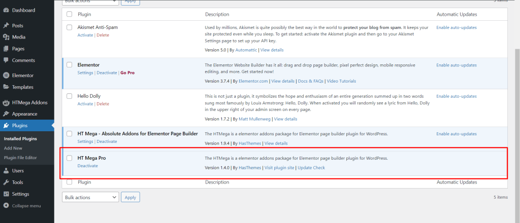
Make sure you have installed and activated the HT Mega Pro.
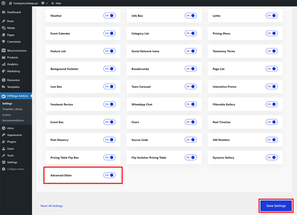
Step 1: How to Enable Advanced Slider Widget?
Go to WordPress Dashboard > HTMega Addons> Settings > Elements. From the list of Elements, turn ON the “Advanced Slider” widget.
Step 2: How to use the Elementor Advanced Slider Widget?
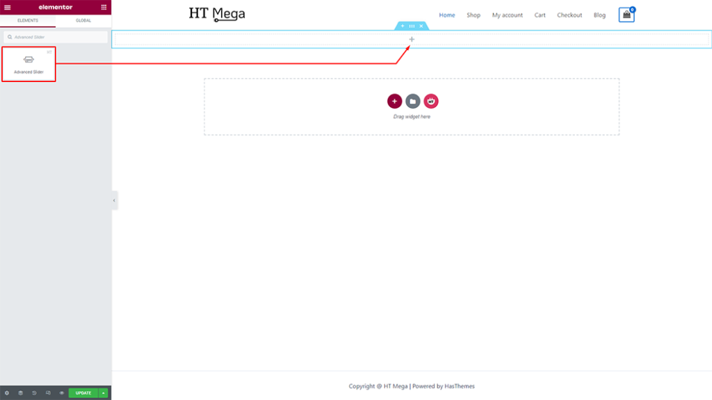
To add the Advanced Slider widget, search by “Advanced Slider” and use the widget that has the “HT badge”
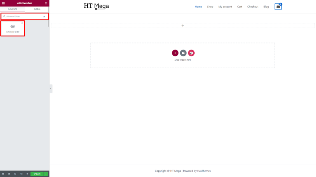
Drag and drop the HT Mega Advanced Slider widget onto the Page Template.
Step 3: How to customize the Elementor Slider Widget?
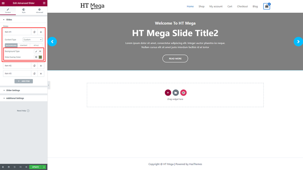
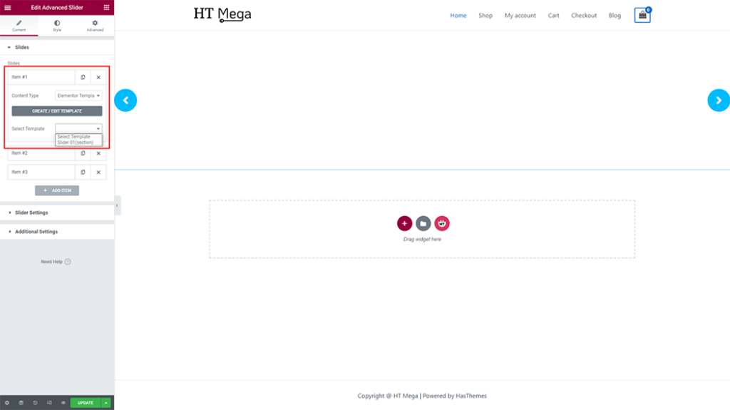
Once you add the Advanced Slider widget, you will see Slides, Slider Settings, and Additional Settings section under the Content tab. Now, you can update them from here.
Slides: Select your preferred Content Type, either Custom or Elementor Template.
Background: As per your preference, you have the option to alter both the background color and background overlay
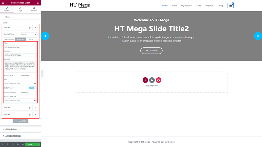
Content: As per your requirements, you have the ability to modify the title, subtitle, content, button text, link, second button, second button text, and second button link.
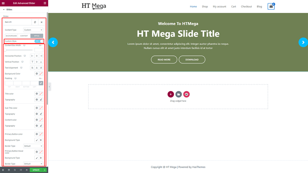
Style: By enabling “Custom Style,” you can tailor the item’s unique style to your preferences. Afterwards, you have the freedom to Style a title, subtitle, content, and button as desired. Additionally, you can customize its color, typography, position, and animation options to further enhance its appearance.
Elementor Template: You can add slides by create a live Elementor template or by select an existing template, which can be built with Elementor widgets for unlimited design possibilities.
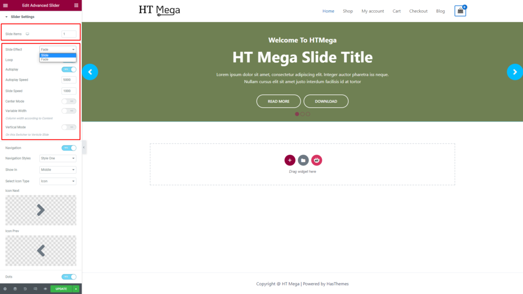
The Slider Settings section offers a variety of options, including the ability to select Slide Items, Slide Effect, Navigation, and Dots preferences.
- Slide Items: You have the flexibility to display Slide Items as per your requirements.
- Slide Effect: The Slide Effect option (Slide, Fade) allows you to adjust the slider transition effect.
- Loop: Enabling the Slider Loop option allows the slider to repeat its slides in a continuous loop.
- Autoplay: Activating the Slider Autoplay option enables the slider to automatically play through its slides without requiring any user input.
- Autoplay Speed: The Slider Autoplay Speed refers to the rate at which the slider transitions between its slides when the autoplay option is turned on. It is typically measured in milliseconds.
- Slide Speed: The Slide Speed refers to the amount of time it takes for the slider to transition between its slides. It is usually measured in milliseconds.
- Center Mode: The Slider Center Mode is a feature in some sliders that allows the current slide to be positioned at the center of the slider, while the previous and next slides are partially visible on either side. This can provide a visually appealing and engaging display for the user.
- Variable Width: Enabling the Variable Width option in a slider allows each slide to have a different width, providing more flexibility in designing and arranging content within the slider.
- Vertical Mode: Slider Vertical Mode is a display option for sliders where the slides are arranged vertically, one on top of the other, rather than horizontally. This can be useful for showcasing content in a different orientation or for fitting the slider into a space with limited horizontal width.
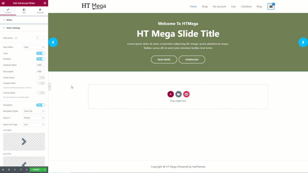
- Navigation: Activating the Slider Navigation option within a slider displays user interface elements. This enables the user to move forward or backward through the content of the slider at will.
- Navigation styles: You can choose your preferred Navigation styles for your slider.
- Show in: You have the option to choose the position of your navigation within your slider. For example: (Top, Middle, Bottom)
- Select Icon Type: You can select the type of icon to be used for your slider Navigation, which can be an icon, image, or text.
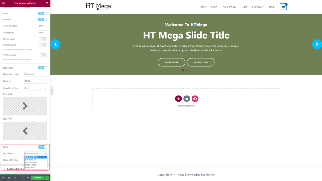
- Dots: Enabling the Slider Dots option within a slider will display the small clickable indicators below the slider, representing each slide in the sequence. This feature provides a visual cue to the user of how many slides are in the slider and which slide they are currently viewing.
- Dots Show in: You have the option to choose the position of your Dots within your slider. For example: (Bottom Center, Bottom Left, Bottom Right, Right Center, Left Center)
- Show Dots Index: Enabling the “Show Dots Index“ option within a slider will display the index numbers of each dot below the slider, providing the user with additional information about the current slide and how many slides are in the sequence.
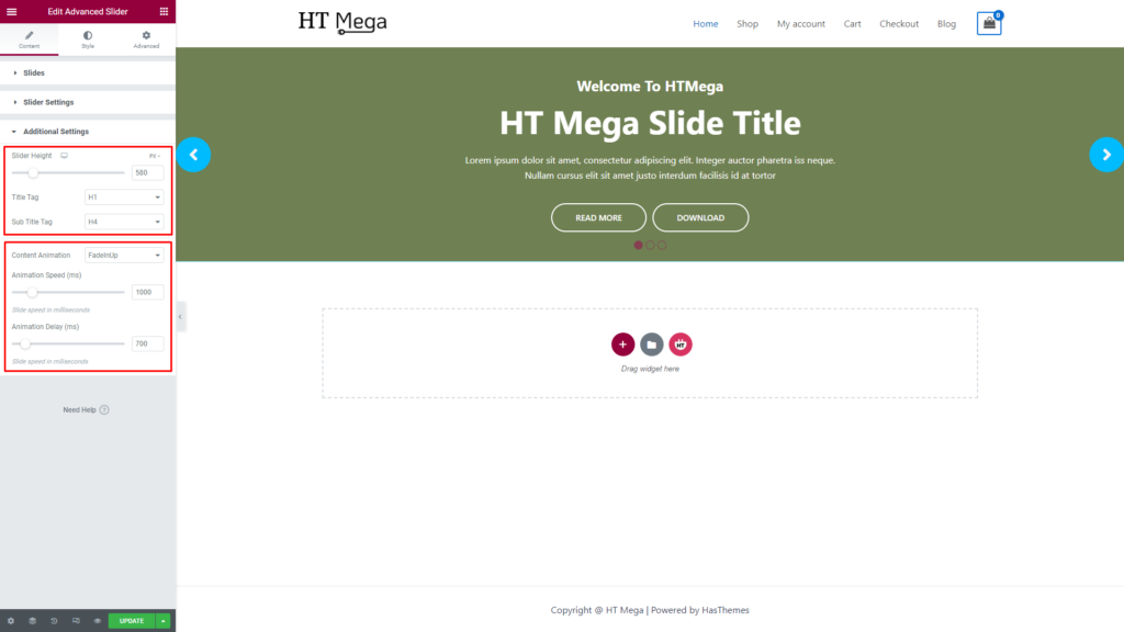
Additional Settings:
You have the option to customize the height of your slider and modify the HTML tags used for the title and subtitle text displayed in the slider. This enables you to tailor the appearance of your slider to your specific requirements and preferences.
Additionally, you can choose a Content Animation for your slider and adjust the animation speed and delay. This feature lets you incorporate captivating and dynamic visual effects to your slider content, enhancing its visual appeal and engaging your audience.
How to customize the Advanced Slider style?
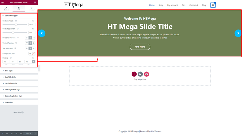
In Style tab you can update Item, Content Wrapper, Title Style, Sub Title Style, Description Style, Primary Button Style, Secondary Button Style, and Navigation style according to your needs.
Content Wrapper: The Content Wrapper of your item can be personalized to your liking, allowing you to customize the style of the item according to your preferences.
Title Style: You have the ability to style the title of your item by customizing its color, typography, padding, and margins. It helps you create a unique and visually appealing title.

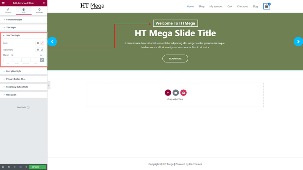
Sub Title Style: It is possible to customize the subtitle of your item by changing its color, typography and margins. This allows you to create a subtitle that is visually appealing and matches the overall style of your design.
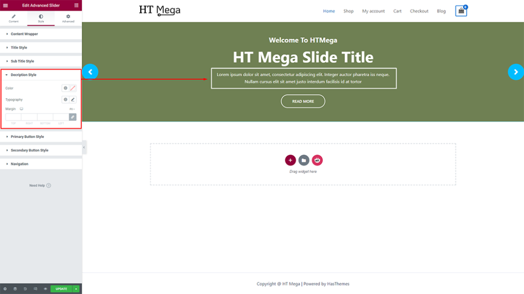
Description Style: Adjust your item Description colors, typography, and margins. This allows for creating compelling narratives that complement the overall style of your design.
Primary Button Style: You have the option to customize the style of the button according to your preferences. This allows you to create a button that is visually appealing and aligns with the overall design of your item.

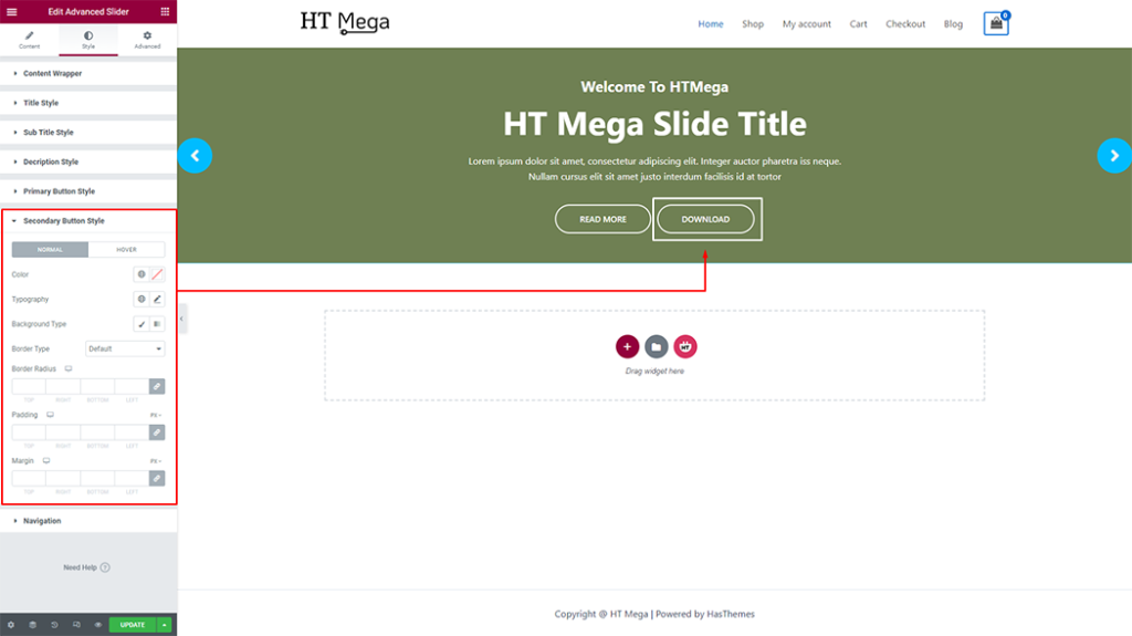
Secondary Button Style: You have the option to customize the style of the button according to your preferences. This allows you to create a button that is visually appealing and aligns with the overall design of your item.
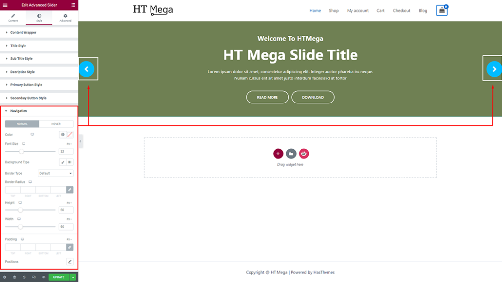
Navigation: You can style the Navigation buttons to your liking, giving you the freedom to create a design that fits your personal preferences and enhances the overall look of your slider.
Usage Examples
Here are some live use cases for the Advanced Slider addon. Follow this link to see more Demos