
The Buttons Block is a highly versatile and configurable block that allows you to integrate visually appealing buttons into your website. It offers a wide range of unique button styles for you to choose from.
Steps of adding Button Block
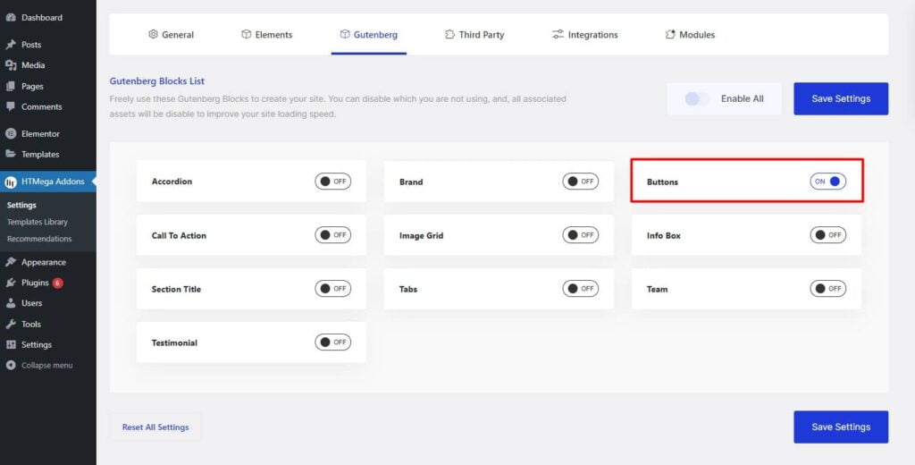
Go to WordPress Dashboard > HTMega Addons> Settings > Gutenberg. From the list of Blocks, turn ON the “Buttons” Block.
Step 1: How to Enable Buttons?
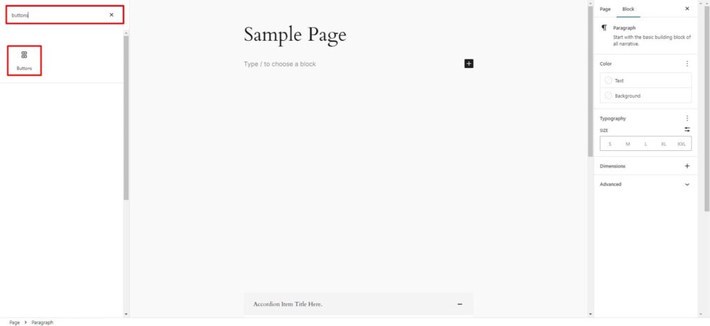
Step 2: How to use the Buttons Block?
To add the Buttons block, search by “Buttons” and use the Block that has the “HT badge”
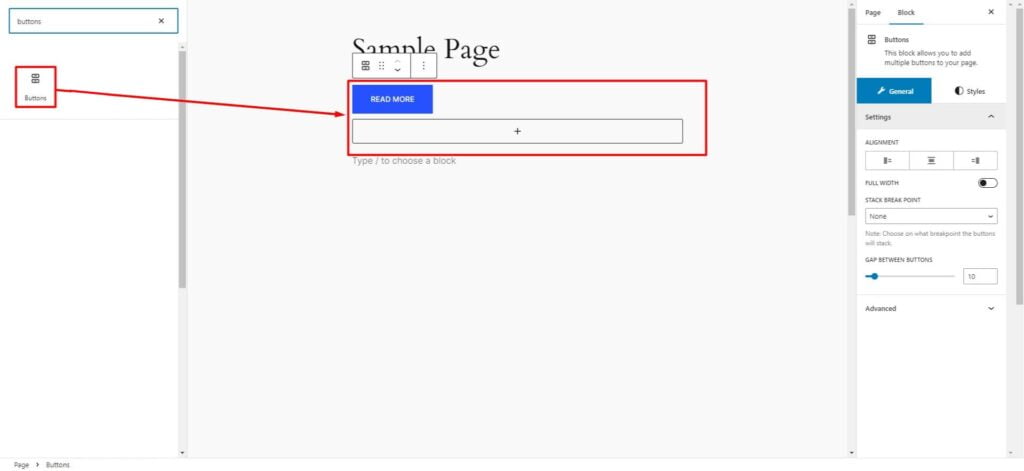
Drag and drop or click on the “Buttons” block to insert it into the page.
Step 3: How to customize the Accordion Block?
Common Settings:
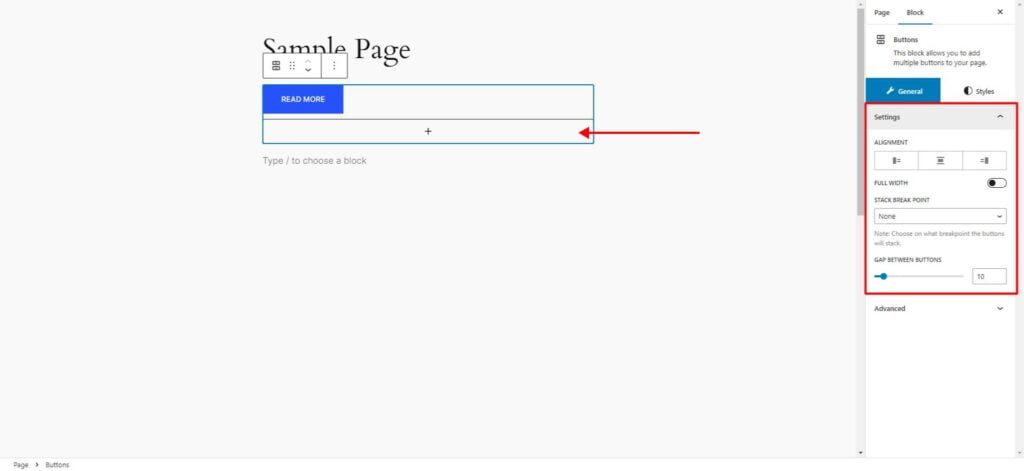
Add New: To add a new button, simply click the plus icon.
Settings: You can Adjust the Button Alignment, Make it Full Width, Choose the Breakpoint at Which Buttons Stack on Each Other, and Set the Gap Between Buttons if You Add More Than One Button.
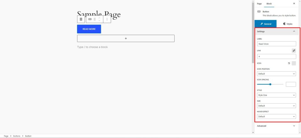
Individual Button Settings
To modify individual button settings, please select a button by clicking on the desired button.
You can change Button Label, Add Link, Add Icon, Icon Position, Space Between Icon and Label, Button Style, Size and Hover Effect as needed.
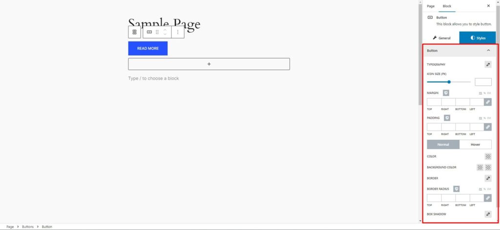
How to customize the Button style
You can change button label Typography, Icon Size, Margin, Padding and (Normal, Hover State) Color, Background Color/Gradient, Border, Radius & Shadow style of the Button as needed.
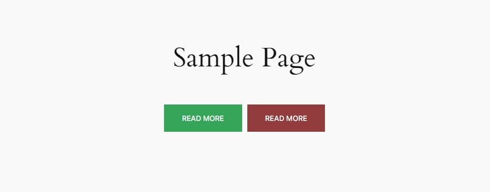
Step 4: Now visit the site
Visit the Page to Preview
Was this helpful?
Good job! Please give your positive feedback
How could we improve this post? Please Help us.