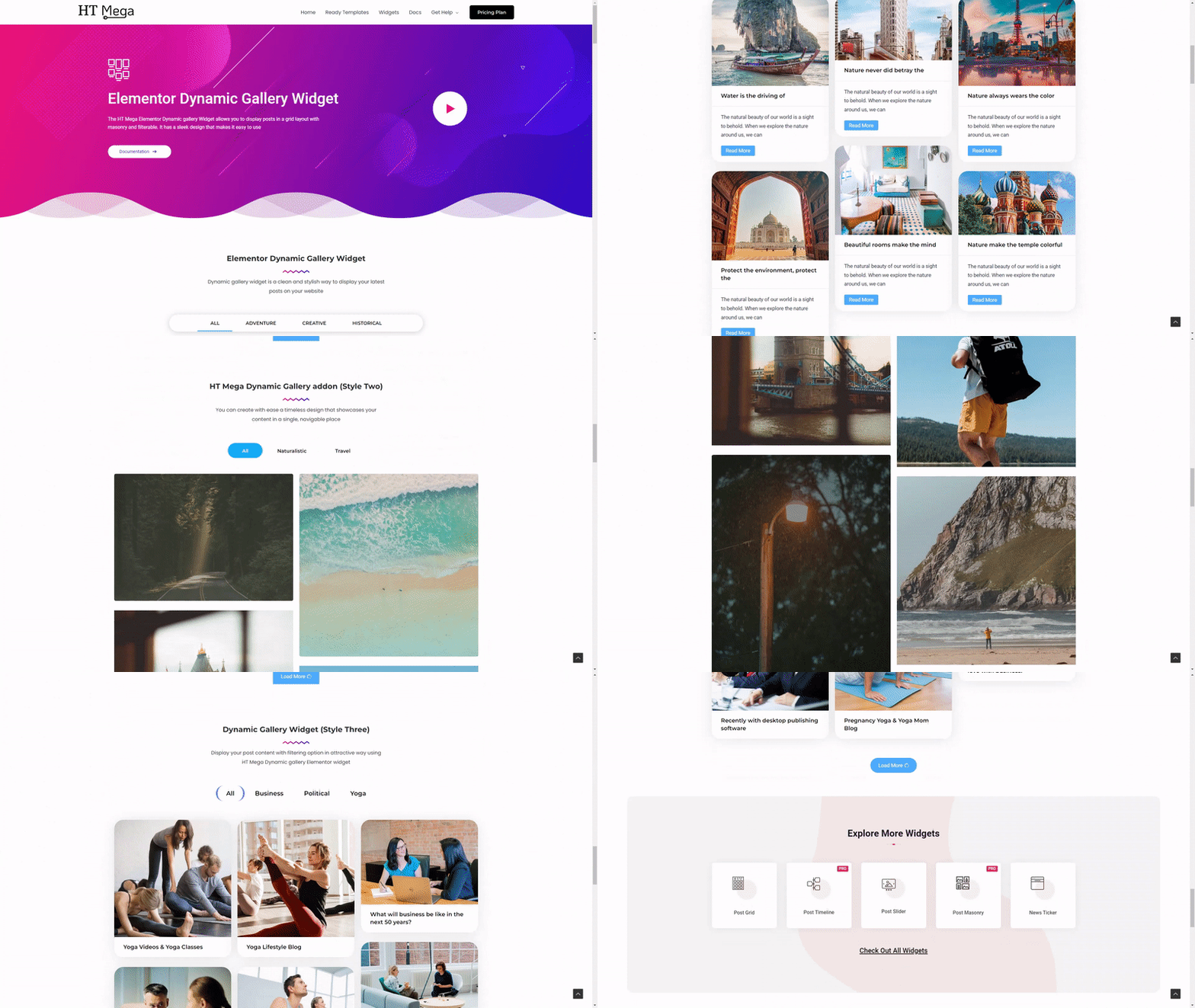
The HT Mega Elementor Dynamic Gallery Widget allows you to display posts in a grid layout with masonry and filterable. It has a sleek design that makes it easy to use
How to use the Dynamic Gallery Widget of HT Mega Addons
Steps of adding Dynamic Gallery Widget
Make sure you have installed and activated the HT Mega Pro.
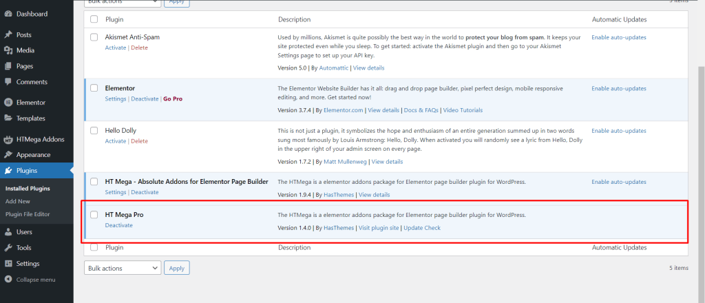
Step 1: How to Enable Dynamic Gallery Widget?
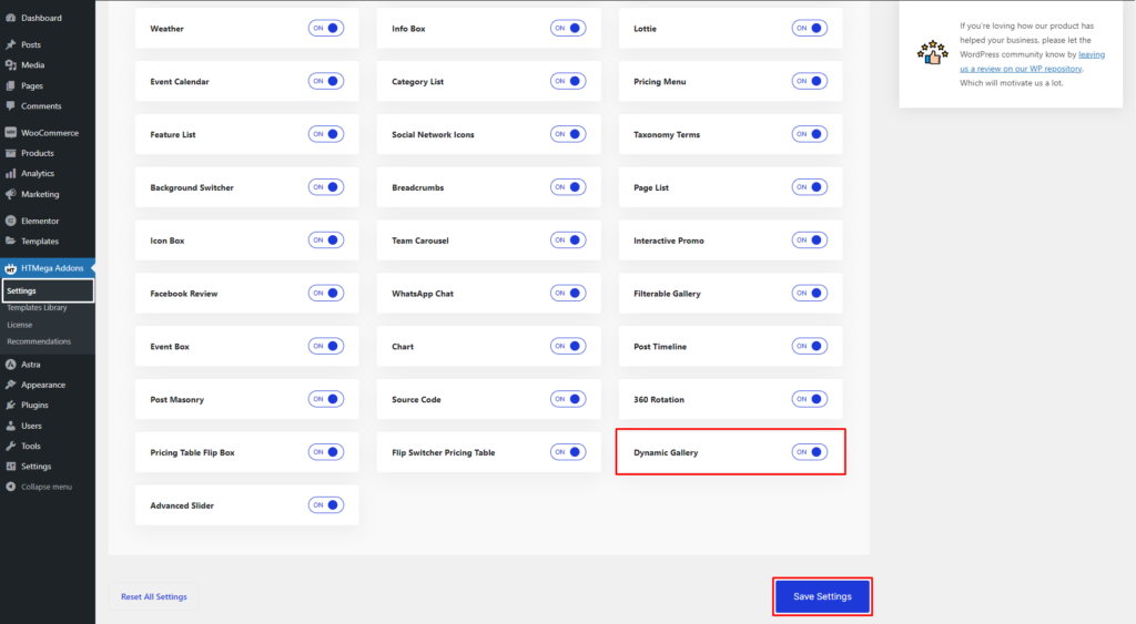
Go to WordPress Dashboard > HTMega Addons> Settings > Elements. From the list of Elements, turn ON the “Dynamic Gallery” widget.
Step 2: How to use the Elementor Dynamic Gallery Widget?
To add the Dynamic Gallery widget, search by “Dynamic Gallery” and use the widget that has the “HT badge”
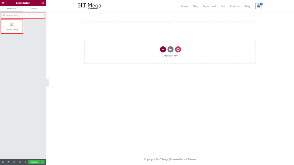
Drag and drop the HT Mega Dynamic Gallery widget onto the Page Template.
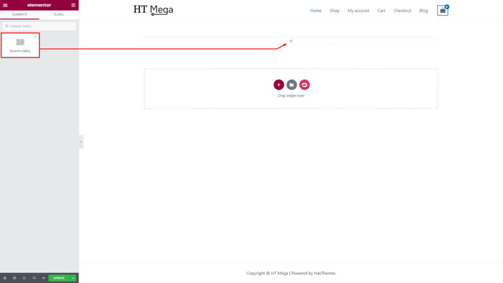
Step 3: How to customize the Dynamic Gallery Elementor Widget?
Once you add the Dynamic Gallery widget, you will see Content Source and Gallery Settings section under the Content tab. Now, you can update them from here.
The Content Source section provides various options, such as Post Type selection, Include By, Category selection, Exclude Posts, Limit, Order By, Custom Date, and Order, to customize the source of the content.
Post Type: Based on your needs, select the appropriate post type such as Posts, Products, Pages, etc.
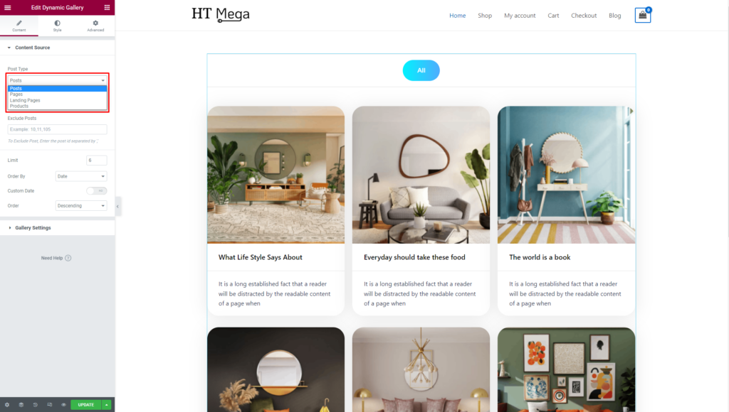
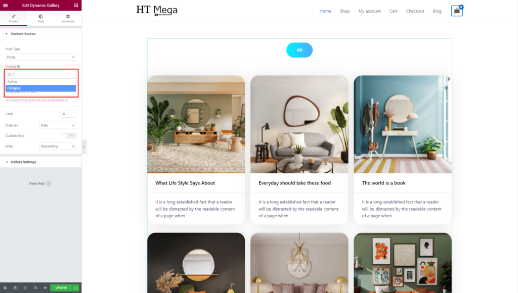
Include By: The “Include By” option allows you to choose the category or author whose posts you want to display.
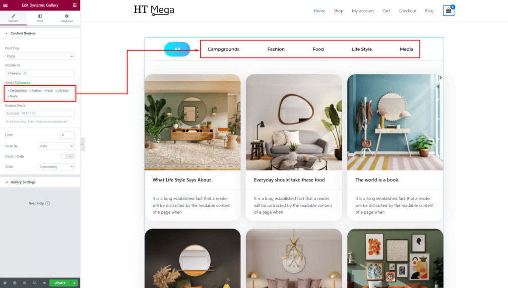
Select Categories: After selecting the “Include By” category, you will be presented with a new input field where you can specify the category of posts you wish to display. By adding categories to this field, you can display posts belonging to those categories.

Once you have selected the category, you will be able to see the filter menu, where you can add the category name and menu item name.
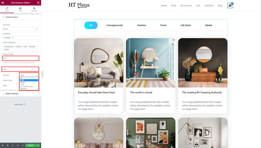
- Exclude Posts: Excluding a post by entering its ID in the “Exclude Posts” field will remove that post from the display.
- Limit: You can set a limit on the number of posts you want to display.
- Order By: “Order by” refers to the sorting order of items in a list or query. It determines how the items will be arranged based on a date, name, title, comment count, and random.
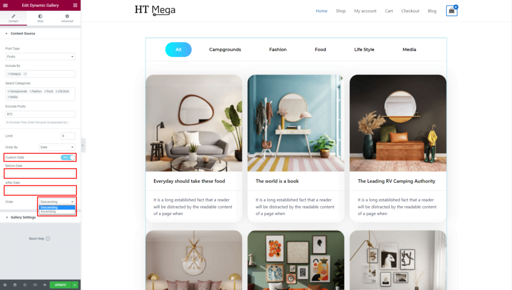
- Custom Date: Enabling Custom Date allows you to set a date range for your posts to be displayed. The posts falling within the specified date range of Before Date and After Date will be visible.
- Order: “Order” allows you to sort items either in ascending or descending order.
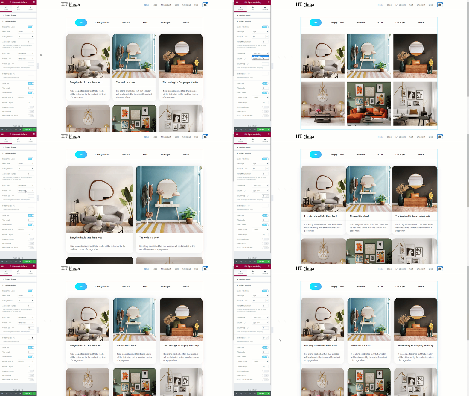
The Gallery Settings section provides various options, such as Enable Filter Menu, Menu Style, Gallery All Label, Active Menu Number, Card Layout, Column, Column gap, Bottom Space, Show Title, Show Content, Read More Button, Popup Button, and Show Load More Button to customize the source of the content.
- Enable Filter Menu: You have the option to hide the menu by enabling the “Enable Filter Menu” option.
- Menu Style: You can choose your preferred menu style.
- Gallery All Label: You can change the text of the labels in Gallery All Labels.
- Active Menu Number: Set active menu number to highlight a specific menu item.

- Card Layout: You can choose your preferred Layout.
- Column: You have the option to select the number of columns that best fits your needs.
- Column Gap: Column Gap refers to the amount of space between two columns in a layout. You can control the column gap if you want
- Bottom Space: The bottom space option allows you to set the distance between the bottom of one item and the top of the item below it. This can help you create a more visually appealing layout by adjusting the spacing between items.
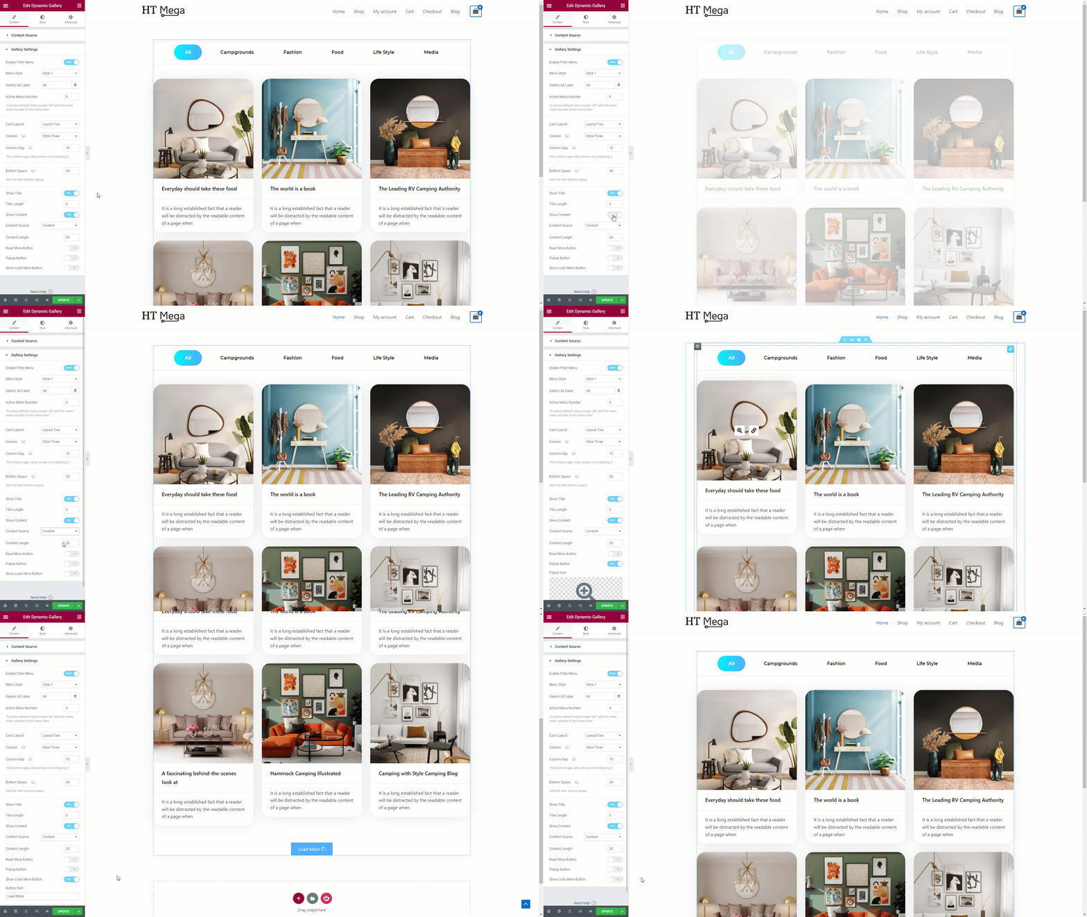
As per your requirement, you have the option to show or hide the following elements: Title, Content, Read More Button, Popup Button, and Load More Button.
How to customize the Dynamic Gallery style?
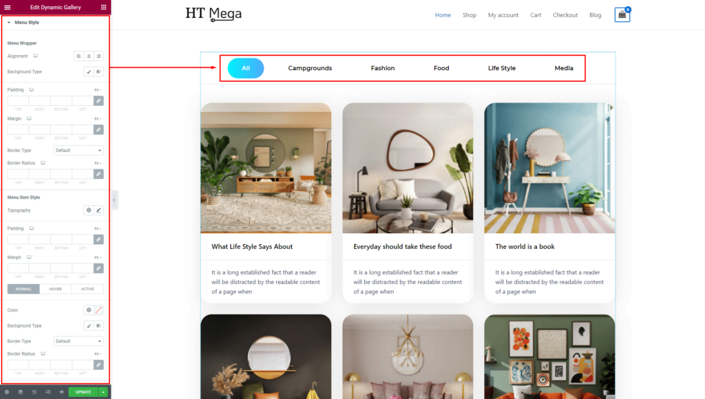
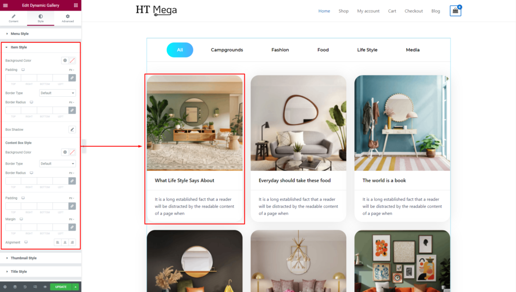
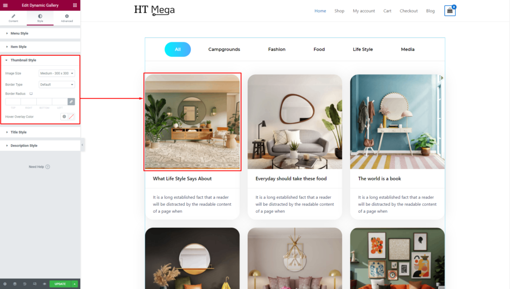
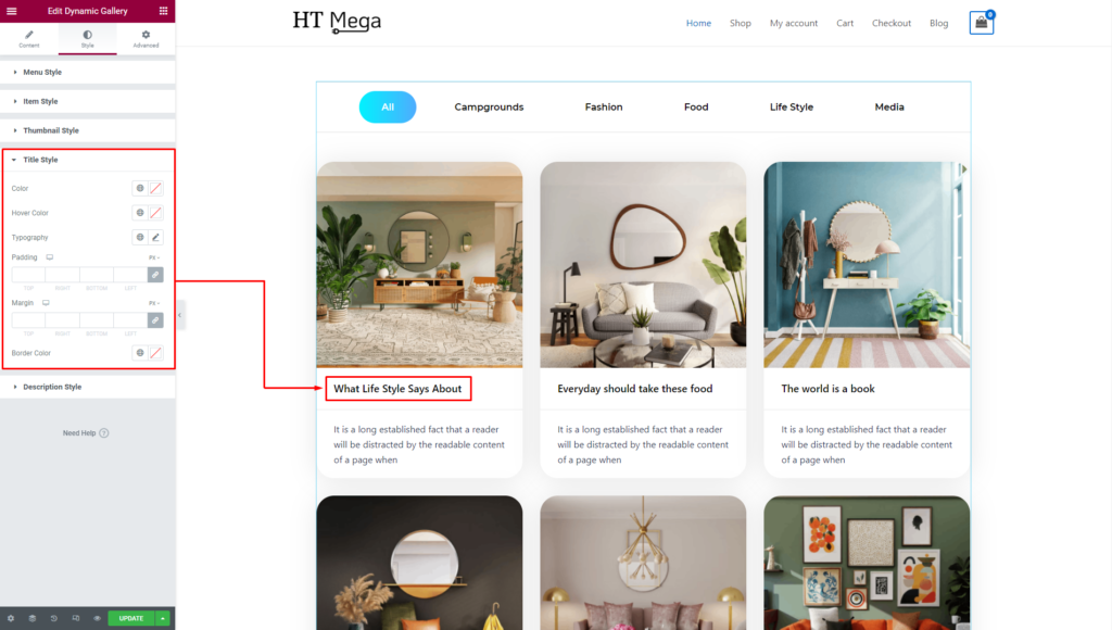
In the Style tab, you can update Menu Style, Item Style, Thumbnail Style, Title Style, Description Style, and Load More Button style according to your needs.
Menu Style: The Menu Style of your item can be personalized to your liking, allowing you to customize the style of the item according to your preferences.
Item Style: You have the option to customize the Item Style of your item, giving you the freedom to personalize the item’s appearance to suit your individual taste and style.
Thumbnail Style: In the Thumbnail section, you can change Thumbnail Size, Border, and Border Radius Control.
Title Style: You have the ability to style the title of your item by customizing its color, Hover color, typography, padding, and margins. It helps you create a unique and visually appealing title.
Description Style: Adjust your item Description colors, typography, and margins. This allows for creating compelling narratives that complement the overall style of your design.

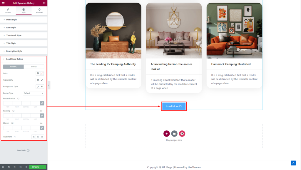
Load More Button: You have the option to customize the style of the button according to your preferences. This allows you to create a button that is visually appealing and aligns with the overall design of your item.
Usage Examples
Here are some live use cases for the Dynamic Gallery addon. Follow this link to see more Demos
